GeoVisualizer
29 Jan 2020 ∞
Shortly after XOXO in 2018 I began running a Compass server to track and store my location. At some point in the future I wanted to have a cool visualization of everywhere I'd been, and nearly a year later I got around to looking at the data.
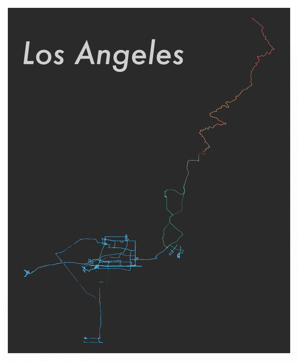
I wanted a good way to visualize the data I'd collected and began testing a tool called [MapShaper], which lets you manipulate GeoJSON files and output SVGs. By default MapShaper will just plot each point as a little black dot, which isn't terribly interesting.
I experimented with ways of applying color to the map to make it a bit more interesting. One of the first things I tried was varying the color by altitude. Compass collects a lot of points, so they blend together into a line.
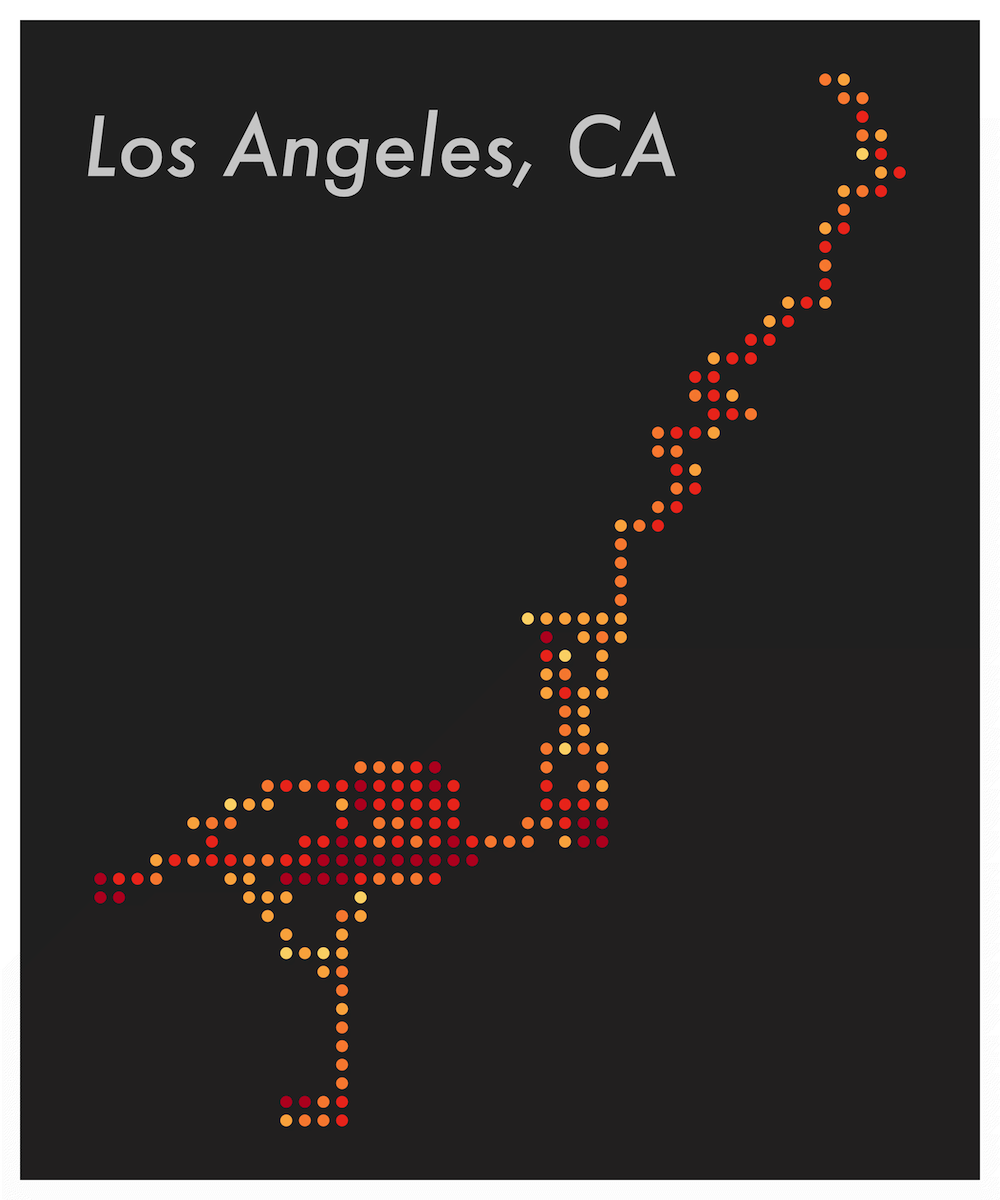
The result was pretty, but didn't really say anything about what I had done there. I wanted something a little more abstract. Eventually I learned that MapShaper can reduce the precision of coordinates and count features, and combining these meant I could get a count of how long I'd spend at a certain location.
With a bit more scripting and a surprising amount of JavaScript I had a new look. The coordinates are reduced to a few significant digits, which aligned them to a grid, and each grouping is counted and colored based point count.
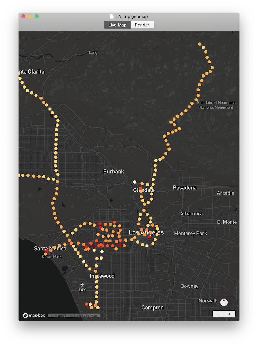
After a little while I got tired of having to manually change values in scripts, so I wrote a little GUI wrapper around my scripts, and then… went a bit further.
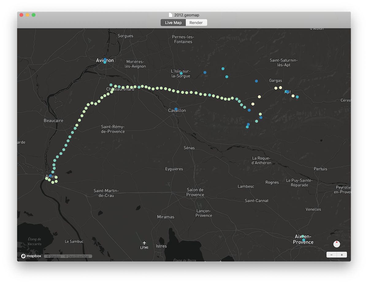
I wanted to recreate the same visualization on a live map, so I turned to Mapbox.
Mapbox required a lot of trial and error, but I eventually had all of the pieces in place. The map groups the points dynamically, colors them by count in the group, and can handle far more points than MapShaper can.
Something I didn't expect after putting the live map together was how much fun it would be to simply zoom around and revisit places I'd been previously. I was especially happy when I found a few GPX files I'd recored back in 2012 while studying in France, I just wish they were more complete.